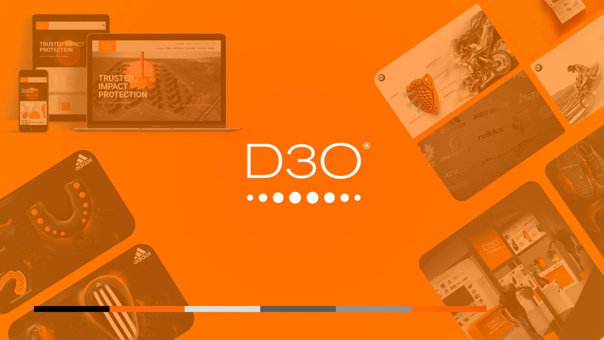
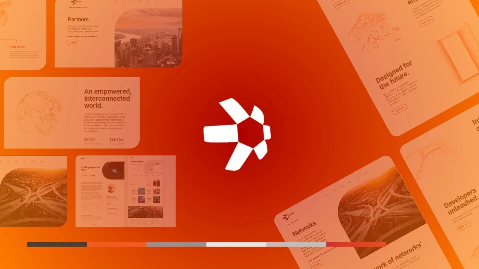
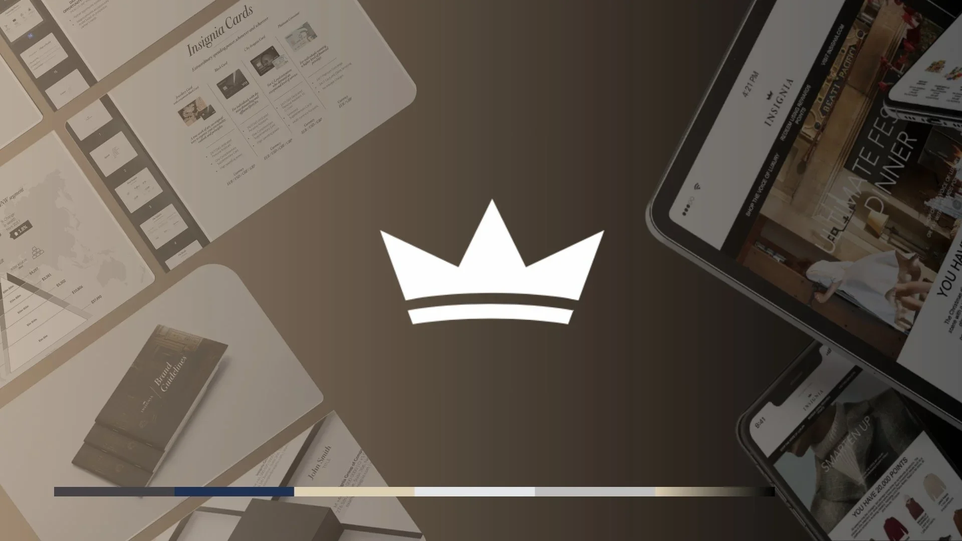
Our Case Studies

Explore case studies that demonstrate the measurable impact of our strategic thinking across leading global brands.

  • Logo of the Digital Pound Foundation featuring a stylized British pound symbol (£) and the organization's name.
  • Dark green crown icon with three points and two curved lines underneath, on a black background.
  • 3D model of a green hexagonal shape with protruding rectangular and curved elements, resembling an abstract geometric sculpture.
  • Black logo with the word 'ROX' in large green letters.
  • Logo with the words "By Suki" in elegant script and "Crafted with Love" below in smaller font, all in dark green
  • Green text spelling out 'suchova' on a black background.
Pringle.media Pringle.media

Digital brand enhancement at global scale

D3O


A cohesive system to support partner engagement and go-to-market across multiple sectors

From fragmented touch points to a unified brand experience

D3O partners with brands across sectors including motorcycle, sports, electronics, workwear, and defence—where product value needs to be understood quickly and communicated consistently.

The work focused on strengthening how D3O shows up across print and digital, and streamlining visual data so teams and partners could build clearer value cases—especially ahead of go-to-market for new products.


Project Highlights


Challenge

D3O needed to improve consistency and clarity across channels and markets—while making complex technology and performance benefits easier to communicate. A key gap was the ability to present evidence and performance data in a way that supported fast partner buy-in and stronger GTM narratives for new product launches.


Solution

Enhance the core identity and build a practical set of tools that support partner conversations and product launches—technology-led graphics, structured performance visuals, packaging, sales materials, and digital assets—backed by a centralised system for managing and deploying content.


Outcome

A stronger, more cohesive brand experience that improved market positioning, strengthened partner engagement, and made D3O’s product value—and proof—easier to communicate ahead of go-to-market across sectors and touchpoints.


What we did


Brand system: unify print and digital

  • Refined the brand identity across key touchpoints to improve consistency and recognition

  • Built a scalable visual approach that works across categories, regions, and partner requirements


Visual data + value case: make proof easier to sell

  • Streamlined performance and technology data into clear, repeatable visual formats (charts, diagrams, comparison narratives)

  • Built value-case templates to support partner decision-making ahead of go-to-market for new products

  • Created a consistent approach to “proof assets” so technical claims were easier to understand and reuse across teams


Technology storytelling: make innovation easier to understand

  • Developed technology-focused visual graphics to communicate D3O innovations clearly across applications (impact, vibration, shock)

  • Created asset frameworks that translate technical performance into simple, commercial narratives for partners


Partner engagement: enable multi-sector rollout

  • Produced product packaging for global partners and sector use-cases

  • Built sales support materials and partnership/pitch assets to support engagement across multiple sectors

  • Supported website development and digital asset creation to improve consistency across the D3O ecosystem

  • Implemented a centralised asset management approach to reduce drift and speed up delivery


Outputs

  • Brand identity enhancement across print and digital

  • Streamlined visual data and value-case assets for go-to-market on new products

  • Technology-focused visual graphics to communicate D3O innovations

  • Product packaging design for global partners

  • Sales support materials and partnership/pitch creation

  • Website development support and visual asset creation

  • Centralised asset management system


Delivered while contracted as part of the internal team.

Read More
Pringle.media Pringle.media

E-commerce built for modern conversion

SYCHOVA


Translating a fashion ethos into a responsive online store

From brand mood to a shoppable experience

SYCHOVA is a fashion brand inspired by nostalgia—pulling from the past to create a distinct, emotive identity. The challenge was to bring that feeling into a digital experience without sacrificing clarity, usability, or purchase flow.


Project Highlights


Challenge

Create an e-commerce experience that feels unmistakably SYCHOVA—rich in tone and identity—while still delivering the fundamentals of a high-performing store: responsive design, clear navigation, and a frictionless checkout.


Solution

A responsive e-commerce website designed to translate SYCHOVA’s nostalgic aesthetic into a structured, conversion-ready shopping journey—balancing brand expression with clean UI patterns and straightforward purchase flows.


Outcome

An engaging, brand-aligned online store that improved the customer experience, supported sales, and strengthened SYCHOVA’s identity through a consistent, shoppable digital presence.


What we did


Brand translation: turn nostalgia into a usable system

  • Defined a digital look and feel that honoured the brand’s nostalgic references without clutter

  • Built a UI approach that kept product content clear, readable, and premium


Shopping journey: reduce friction from browse to buy

  • Designed responsive page templates for product discovery, product detail, and checkout

  • Prioritised hierarchy, spacing, and interaction cues to improve confidence and speed


Build-ready delivery: design that ships cleanly

  • Produced full UI design for handover and implementation

  • Integrated a payment-ready checkout flow to support end-to-end purchasing


Partner engagement: enable multi-sector rollout

  • Produced product packaging for global partners and sector use-cases

  • Built sales support materials and partnership/pitch assets to support engagement across multiple sectors

  • Supported website development and digital asset creation to improve consistency across the D3O ecosystem

  • Implemented a centralised asset management approach to reduce drift and speed up delivery


Outputs

  • Responsive e-commerce website design

  • Full UI design

  • Integrated payment system


Read More
Pringle.media Pringle.media

Startup to global recognised go-to-market

QUANT


Building a unified brand system across digital and investor touch points

From early-stage clarity to market readiness

Quant was moving from startup phase into go-to-market. The priority wasn’t just “a new look”, but a brand that could scale globally, stay consistent across teams, and hold up in commercial and investor conversations.

The work focused on aligning strategy, story, and execution into one system—so every touchpoint reinforced the same message.


Project Highlights


Challenge

Quant needed to transition from an early-stage identity into a credible global brand, without fragmentation across product, marketing, and investor communications.


Solution

A unified brand strategy and design system that translated positioning into practical tools—web, UI components, and investor-ready assets—so the team could move faster without losing consistency.


Outcome

Stronger brand recognition, cleaner consistency across channels, and improved commercial credibility—supporting go-to-market activity and investor-facing communications.


What we did


Startup phase: establish the foundations

  • Clarified positioning and message hierarchy

  • Defined the narrative that works for both buyers and investors

  • Set principles to guide decisions as the brand scales


Go-to-market: turn strategy into launch-ready communication

  • Built a structured story for web and campaigns

  • Created a repeatable system for content and rollout

  • Ensured the experience signalled trust, clarity, and maturity


Scale: systemise delivery across touchpoints

  • Designed a component-led UI approach for speed and consistency

  • Created governance through a design system and library to reduce drift


Outputs

  • Website redesign

  • Comprehensive design system & UI library

  • Campaign and investor-facing assets

"We now have a worthy showcase with which to tell our story.”

CMO - Quant


Delivered while contracted as part of the internal team.

Read More
Pringle.media Pringle.media

Physical print to digital platform consistency

INSIGNIA


A complete brand overhaul, implemented across every touchpoint from cardmember collateral to web and portal

From physical prestige to digital consistency

.INSIGNIA sits at the intersection of premium payment cards and luxury lifestyle management, serving a membership model built around exclusivity.

This project started with the physical brand experience—printed collateral and production guidance for UHNWIs and cardmembers—then evolved into brand guidelines, and finally transitioned into digital platforms where members manage services and card activity.


Project Highlights


Challenge

The brand experience needed to feel consistent and premium across global touchpoints. At the same time, the website/portal experience had become unreliable and inconsistent creating friction in journeys that should feel effortless and high-trust.


Solution

A ground-up brand rebuild, then disciplined implementation across physical and digital so every touchpoint (print, guidelines, web, portal) followed one coherent system and elevated INSIGNIA’s global presence.


Outcome

A stronger, more unified global brand presence supported by premium print standards and a modern, responsive web/portal experience designed around usability and ongoing performance improvement.


What we did


Brand journey: start with physical, set the standard

  • Designed a suite of UHNW payment cards in collaboration with Visa translating the brand into a premium, tactile product through material-led design and production-ready specifications

  • Built cardmember-facing print collateral and a consistent physical brand experience

  • Established print guidance and production-ready rules to protect quality and consistency across suppliers

  • Created brand guidelines to scale across teams, regions, and touchpoints


Transition to digital: translate the brand into experience

  • Converted brand principles into a digital UI language (components, spacing, hierarchy, motion/interaction rules)

  • Aligned messaging and structure so benefits and services read clearly across key journeys.


Website + portal revamp: rebuild for responsiveness and performance

  • Redefined journeys, flows, and interactions to reduce friction

  • Introduced a more structured content architecture to support dynamic updates

  • Strengthened analytics and data collection to improve visibility and decision-making

  • Worked closely with a remote development team through build and launch


Outputs

  • Brand overhaul from the ground up (strategy, identity system, guidelines)

  • Premium print collateral + print production guidance for UHNW and cardmembers

  • Full UX redesign: wireframes, flows, UI design, interactions

  • Responsive website/portal build with dynamic content architecture

  • Enhanced data collection and analytics


Read More